Product packaging should be a sensory experience. Consumers make most purchasing decisions within 2.5 seconds, deciding on each item instinctually while shopping in stores or online. With such a tight attention span, consumer decisions become primarily visual: What colors, materials, and textures set one product apart from the next? How does its packaging make you feel?
Color Marketing – What It Is and Why It Works
The first, and often most crucial, way to reach a customer is by color. Retail giants like Marshalls organize products in a rainbow, not just to make the shelves look organized, but to draw the eye. In a mix of clothing, tech accessories, and handbags, the beauty aisle with a vibrant red-to-purple gradient becomes a focal point. With 2.5 seconds to reach a customer, an attractive packaging color is often the difference between being overlooked and standing out.
The psychology of color has been used in marketing and advertising for decades, traceable to the first half of the 20th century with iconic packaging such as the red Coca-Cola can and the rich purple wrappers on Cadbury chocolate bars. These traditional ideas of advertising consider colors to represent the following:
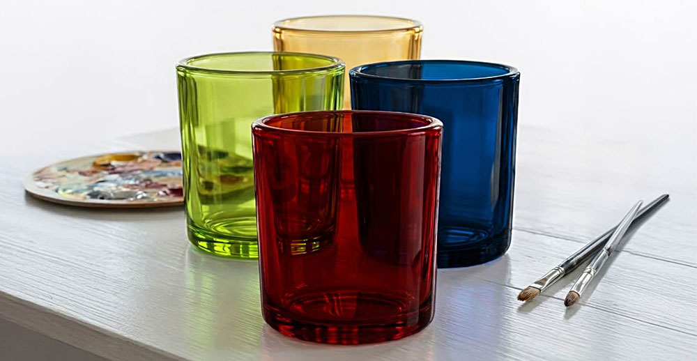
- Red: Urgency, Passion, and Excitement
- Blue: Trust and Calm
- Green: Health, Nature, and Freshness
- Yellow: Positivity, Warmth, and Youth
- Purple: Rarity and Luxury
- Brown: Growth, Nature, and Comfort
- Black: Sophistication and Luxury
Products may also include gold and silver as part of their packaging, or as a color on the label. These colors draw attention for their connection to precious metals, with gold representing wealth and strength. Silver is more elegant, pairing well with light colors for sophistication or added femininity, while pairing silver with dark colors offers sleek modern appeal.
How Color Signals Quality – Food, Fragrance, and Personal Care
Quality packaging is the gateway to high-demand food, home fragrance, and personal care products. An eye-catching silhouette or color complement can make the difference between stealing a customer’s attention and being skimmed over for a different product on a full shelf. Within competitive markets, glass packaging pushes the visual impression of these products to the next level, and the perfect color choice can take them one step further.
A customer’s first impression of a product determines what that product is. For instance, a woman shopping for an herbal blend with a spicy kick will gravitate toward red packaging, even if there is a spicier blend in a black container two bottles down. While the black bottle’s manufacturer chose to emphasize sophistication, most customers will not check small seasoning labels one by one to notice that Blend B is spicier than the red Blend A. As far as the customer perceives, the red bottle will have the spiciest seasoning.
Food Packaging
Studies have reported that, when shopping for food, consumers respond positively to cooler colors in product packaging, while warm colors may catch more attention initially. Consumers consider cool-colored packaging to be more “healthy” and less tasty, which occasionally reduces their intentions to purchase the product. Highly saturated colors in food packaging also signaled “fresher and healthier” food, versus lower saturation.
Taking into account the food category and the consumer the product is marketed toward, packaging material and color can distinguish one high-quality product from other products that have an outdated aesthetic. For instance, an infused olive oil in a green-tinted recycled glass bottle charms customers more than the same oil in a plastic bottle. Both bottles are translucent to display their contents, but the greener bottle may offer an impression of more natural ingredients, higher health-consciousness, and a more refined taste. Health-conscious customers may even opt for the glass bottle simply to avoid microplastics and advanced oil degradation, making the modern option more alluring.
Home Fragrance
Candles often represent spirituality as a staple in self-care rituals, given their psychological impact of reducing stress, enhancing relaxation, and the ability to boost mood and focus. When crafting a centerpiece for self-care, candle makers can opt for earthy packaging to provide the comfort and security of those colors’ psychology. Oftentimes, candle packaging becomes a large indicator of its scent and, as a result, its benefits—for instance, a purple jar may signal a drowsy lavender scent marketed to soothe insomnia.
Given that customers’ perception of a product determines their level of interest, the packaging is what draws potential buyers to sample the wax’s aroma. Adding premium candle accessories like pale or black bamboo lids can bring even more color contrast and natural aesthetics to candles to help them stand out further.
Personal Care
Recent studies on the impact of color on packaging impressions have found that, across most product categories, light-colored packaging gives the impression of purity and natural ingredients. Previously assumed to be the luxurious packaging choice, darker colors were also recently proven to signal strength, in some cases masculinity, and a premium or trustworthy product.
Accepting these color psychology findings as truth, then accenting a beard balm with a matte black jar and silver screw cap would appear to be of better quality than the same balm in a simple silver or black tin. Similarly, an antioxidant serum in a glossy white glass bottle is more desirable than plastic bottles to customers desiring clean ingredients and natural sourcing.
Choosing packaging becomes almost as important as the product itself—if the packaging doesn’t represent a product accurately, its intended customer may not find it or may find its packaging to be misleading. With cosmetics, light or dark packaging often determines the type of customer that will notice the product and, if their sensory experience goes well, purchase it.
Choosing the Right Packaging Colors – Match Your Product Promise
Combining the impact of visual appearance and the limited attention spans of consumers in a saturated modern market, packaging becomes an important determining factor. Manufacturers use packaging to curate the future of their products, using color to decide whether it is perceived as all-natural, comforting, luxurious, or innovative. First impressions are important—make your product’s impression a good one.
If you’d like help choosing the right shade—or want to explore a custom color for your glass packaging—we’re here for you. Visit our Custom Color page to start your color journey today.
