A lid label may not have been the first thing you thought of when you initially envisioned your product design — but for many products, it’s a tried-and-true branding asset. In this guide, you’ll find some useful tips for making the perfect jar lid labels.
Reasons to Label Your Jar Lids
There are many cases where a lid label can be very helpful to your product packaging design. Here are a few benefits your product can see from having a great label on your closure:
- Perception of Quality: The customer’s intuition is that if you put more effort into your label and packaging, it’s likely you’ve put more effort into your product.
- Customer Exposure to Branding: Especially for small jars with little space on the front for labeling, a closure is a great place for a logo or images that speak to your brand’s message.
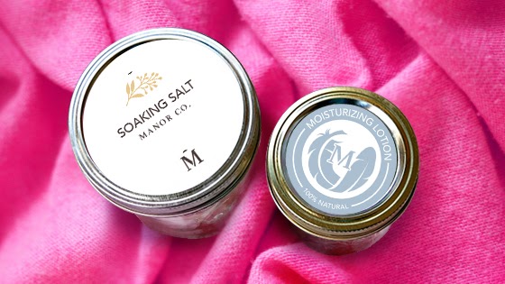
- It’s Extra Space: The label on the front of the jar is what customers see first. Facts like expiration dates, or the scent in your candle product line, can go on the lid to save space for more attractive images and text on the jar’s main label.
Jar Lid Label Design Tips
With any label, you want to make sure that you make the most of the space given to you. However, this doesn’t mean you should clutter the label space with an abundance of words.
On the contrary, pictures speak louder. The most successful packaging labels keep their written copy short and sweet.
Packaging design trends in today’s world prefer the following on product labels:
- Few words
- Easy to read
- Captivating design
- Logos & images associated with your brand
There’s a good reason for this trend; customers spare only seconds to analyze your product on the shelf. It’s important to make it easy for them to consume your brand image, and fine print does much the opposite.
However, for jar lid labels, the rule of few words is a little less strict. In the event that you have must-include information, perhaps safe-use instructions for your product, the lid label is a great place for this text, as it keeps the clutter away from the front of your jar.
Using Negative Space on Your Lid Labels
Negative space goes a long way in the world of design. With the front of your glass jar, you use empty space to show off the color of your candle or essential oil. Meanwhile, empty space on your lid shows off your attention to detail.
On your cap, there are likely negative spaces on the label and on the lid itself. The empty spaces here show off the colors and materials of your lid and label and make your product a standout.
Your logo and design are surely important, but obtaining the right proportion between negative space and printed design ensures your product is better seen and better received.
Types of Material for Jar Lid Labels
What sets the good cap labels from the great is often the material. It’s not a make-or-break investment, but we’ve all seen the packaging labels that do even more to be better-recognized on the shelves.
In short, the label material should speak to your product! Different label materials resonate with different characteristics of industry products. Some examples include:
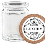
- Matte Label: A natural texture that customers associate with organic products.
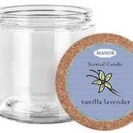
- Brown Kraft Paper: Similar to matte labels, but more often paired with scented and natural products.
- Metallic Foils: Pairable with many products, from fragrance bottles to specialty candles; the foil’s shine catches eyes from afar.
- Wax Seals: Great for liquid products, wax seals add a layer of security.
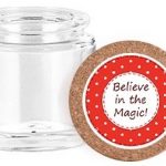
- Stickers: Common but versatile, stickers are the simple and easy way to make a label. Oftentimes, less is more.
Fonts & Colors for Your Lid Label
Picking out the font and colors for your product label can be the most fun part of designing your packaging!
Still, the choices you make here are important ones. The design needs to appeal to your target customer base, helping your product be a top contender on the shelves.
Tips for Picking the Right Font for Your Label
There’s plenty of fonts to choose from, and you certainly want one that speaks to your brand, so to help you choose the right font, consider these 3 tips:
- Legible: This one is the biggest necessity! Customers are more likely to buy your product if they can read your product quickly and easily.
- Consistent: We suggest using the same font across different media. This helps keep your branding consistent. So, your font should work for print, desktop computers, and mobile devices.
- Flexible: On a label and across your promotional media, you’ll sometimes want text thicker or thinner, or with more spacing. Your font should have multiple weights for building a typographic hierarchy.
Tips for Picking the Right Colors for Your Lid Label
The color scheme of your product can convey a world of emotion and character at a single glance.
Different colors typically represent different ideas. Some colors that customers are often receptive to include:
- Green: Environmental and relaxed
- White: Secure and clean
- Black: Stable and wise
- Blue: Creative and happy
- Orange: Vitality, hunger, and adventure
Choosing colors that stand out from your competition is often the smart decision. Visual Capitalist has done some great work in their article by analyzing companies in 26 industries by their color scheme.
Take a look there to see how to communicate within those industries, and where you can stand out with your own colors.
Your Jar Lid is Ready for its Perfect Label
If you’ve decided a lid label is best for your packaging design, we do hope this guide has helped inform you of some best practices. For more labeling tips, check out our article here.
