
It’s no secret that product packaging influences consumer decisions. Customers distinguish brands based on how they look on the shelves, meaning packaging colors are key to visibility. Thankfully, there is plenty of public research into color theory—how colors affect emotion and behavior. Below is a guide to picking the right colors for your product packaging
How color theory and packaging design influence consumers
An Ipsos poll found that over 70% of US consumers agree that product packaging influences their shopping decisions. That is to say: consumers filter through competing products based on how they look on the store shelves. It’s important that customers notice your product among all the competition. Aim for customers to see your product in-store, and to see it quickly.
What is Color Theory?
Color theory suggests that colors evoke emotions and help determine behavior. This study has grown more specific over time, now identifying common emotional responses upon exposure to certain colors. Listed below are some typical color-emotion relationships according to color theory:
-
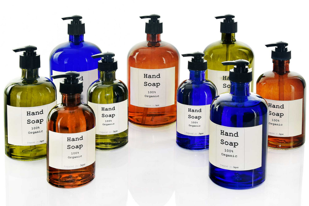
- Red: Urgency, excitement, appetite
- Green: Calm feelings and the association with health, peace, or nature
- Blue: Security and trust; the brand often appears intelligent
- Purple: Feelings of creativity, beauty, wisdom and problem-solving
- White: Purity and cleanliness
- Black: Respect and certainty; the brand comes across as an authority figure
- Orange and Yellow: Optimism, joy, the sense of adventure
- Orange and yellow often produce similar results according to color theory, but distinctions still appear. Depending on other design elements and the target audience, orange may evoke feelings of caution as opposed to adventure.
Why Color Theory Matters to Your Brand
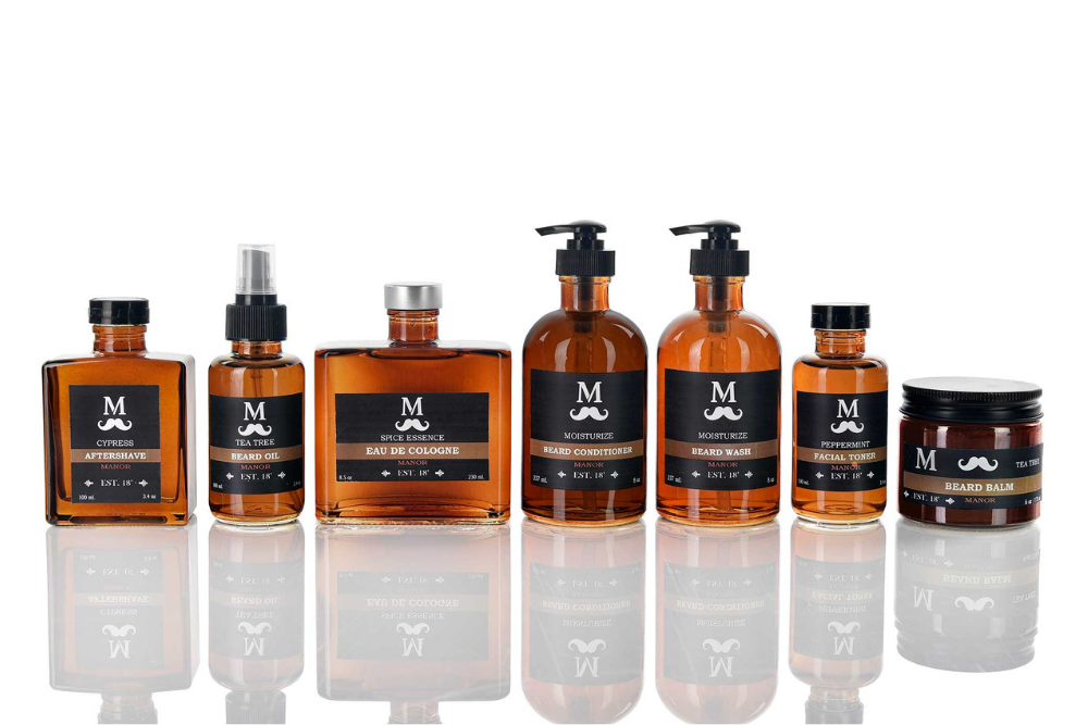
A major part of the branding process is creating a color palette. The colors here are used in product packaging, advertising, social posts, and other marketing channels. This is where it benefits you to have a baseline knowledge of color theory. Thanks to your knowledge of how colors impact consumers, you’ll have a much easier time building a color palette for your brand.
As you decide on the color palette, keep brand identity in mind. What kind of personality does your brand have? If your brand was an individual person, how would they act and speak to your consumers? Let these questions drive your color selection and branding.
Choosing the Right Packaging Color
With a color palette established, you still need to decide on the best color option for your packaging. We suggest you start by checking out your competitors’ packaging and researching your target audience. It’s important that you know what products are succeeding before you enter a new product into the market.
3 criteria for the perfect packaging color are explained in the sections below:
The color represents your brand
Packaging color determines how consumers envision the personality of your brand. Long-term success comes with a consistent brand personality; consistency makes your brand memorable. A good packaging color is an honest reflection of both the brand identity and the product inside.
The color gets customers’ attention
Customers don’t spend much time looking up and down the shelves. Differentiate your brand from your competitors. the reader’s packaging from competitors to be unique and noticeable
The color creates emotional connections
Consider how you want consumers to feel when they see and purchase your product. These emotional responses are at the center of color theory. So, although emotions are based on the individual, color theory
As an example, think of Starbucks. Their familiar green color promotes peace and relaxation in their shops, and extends even after customers leave with a coffee in-hand.
Reminder: color isn’t the only element that evokes emotion. The product label, font choices, and packaging material also contribute to the consumer’s emotions and shopping habits.
Trending Packaging Colors in 2022
Keeping up with current trends is important for any business. Provided you are staying true to your brand, incorporating trending colors attracts new eyes to your product.
Currently, a shade of blue with hints of violet has become Pantone’s Color of the Year. This color, Very Peri, is known for being an uplifting color “that encourages courageous creativity and imaginative expression.” Whether you incorporate this Pantone color into your packaging, keep it in mind as an indication of current color trends.
Alongside this shade of blue, gradients are hot in the packaging world and beyond. Gradients add texture to product packaging while still being minimal and clean. Consider a smooth gradient between two similar colors, or a gradient with white on one end of the spectrum.
Is it time for a packaging redesign?
Packaging redesigns are common among many brands. Some brands redesign more often than others, so you may find it difficult to know when to change. This is especially true if your product has been mostly successful, or if a decline has only just begun.
Listed here are a few signs that it’s time for a redesign:
- Your style is outdated: It’s been decades since a packaging change and new customer acquisition is lacking.
- You blend in too much: Your products look too similar to your competitors, meaning you aren’t getting attention on the shelves.
- Sales are low: Your online marketing excels and your product is high-quality, but the sales just don’t show it.
Changing seasons, holidays, and the rise of new trends also indicate good times for a redesign. Even if your product has been successful to this point, a packaging redesign may be in order—even if just for a month.
More design tips for product packaging
Color is not the only factor in great product packaging! Keep the following tips in mind for your next design:
- Design everything with your brand and your target customer in mind.
- Be careful with your words; make sure the verbiage on the label is a good reflection of your brand.
- Minimal text and plenty of open space are great for a clean label design.
- Be user-friendly. Make sure your product is easy to access within the packaging.
- Be eco-friendly. This is becoming increasingly important among consumers, so consider using recycled materials for your next product packaging.
- Once again: be authentic. Let your packaging reflect the product for what it is.
Conclusion
Color theory is a huge help when it comes to designing your next product packaging. You should know about trending colors as well, and your brand identity should be top-of-mind. As you work on packaging design, remember that the first step to getting the sale is getting the customer’s attention.
For your new product, check out our custom color collections for the best in glass packaging!
